BRYLUEN
BRAND IDENTITY & PACKAGING DESIGN
Driven by a lack of affordable all natural beauty products, Tina started creating her own beauty product recipes that rivaled the big brand names. Having sensitive skin, all natural options were often limited and expensive. Her efforts blossomed into a successful business selling all natural beauty products named Bryluen. Bryluen’s clients are loyal and word-of-mouth helped Tina steadily increase sales every month but she knew a professional appearance would help ensure sales continued to increase. Bryluen needed a logo design, business cards and packaging designs.
SKILLS UTILIZED:
CONCEPTUAL DESIGNS


Logo Design
Bryluen, meaning ‘rose’ in cornish, envisioned a simple logo featuring its namesake rose in lavender. In many modern interpretations, a lavender rose tells your loved one that you find them majestic, opulent and special. Bryluen wants each client to feel special when using their products.
Packaging Design
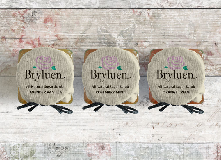
The packaging for Bryluen was designed to highlight the beauty of the lavender coloring while remaining consistent with the all natural theme. As an environmentally-friendly company, Bryluen wanted to ensure that all packaging was designed to be reusable/refillable.
Business Cards
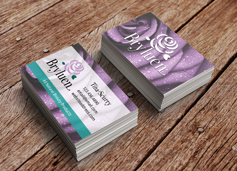
Business cards, arguably the most effective marketing tool, need to make an impact and Bryluen understood this. A bold lavender rose and ‘Tiffany box blue’ adorn the cards showcasing a touch of femininity while standing out among traditional card designs.
“Ange at Elpis Digital Marketing did more than I could have ever imagined. As a first time small business startup, I had no idea where to start. I gave her my company name and the meaning and she took it from there. I couldn’t be happier with the end product. The work Ange and Elpis Digital Marketing did was fabulous and I would recommend her work to anyone!”
